WINE LABLE SYSTEM + LOGO DESIGN + BRANDING
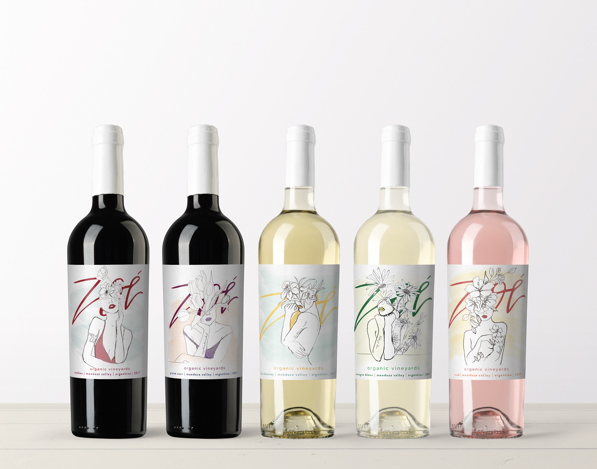
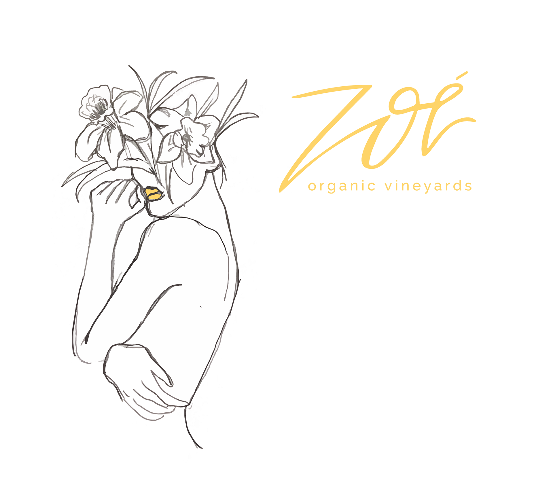
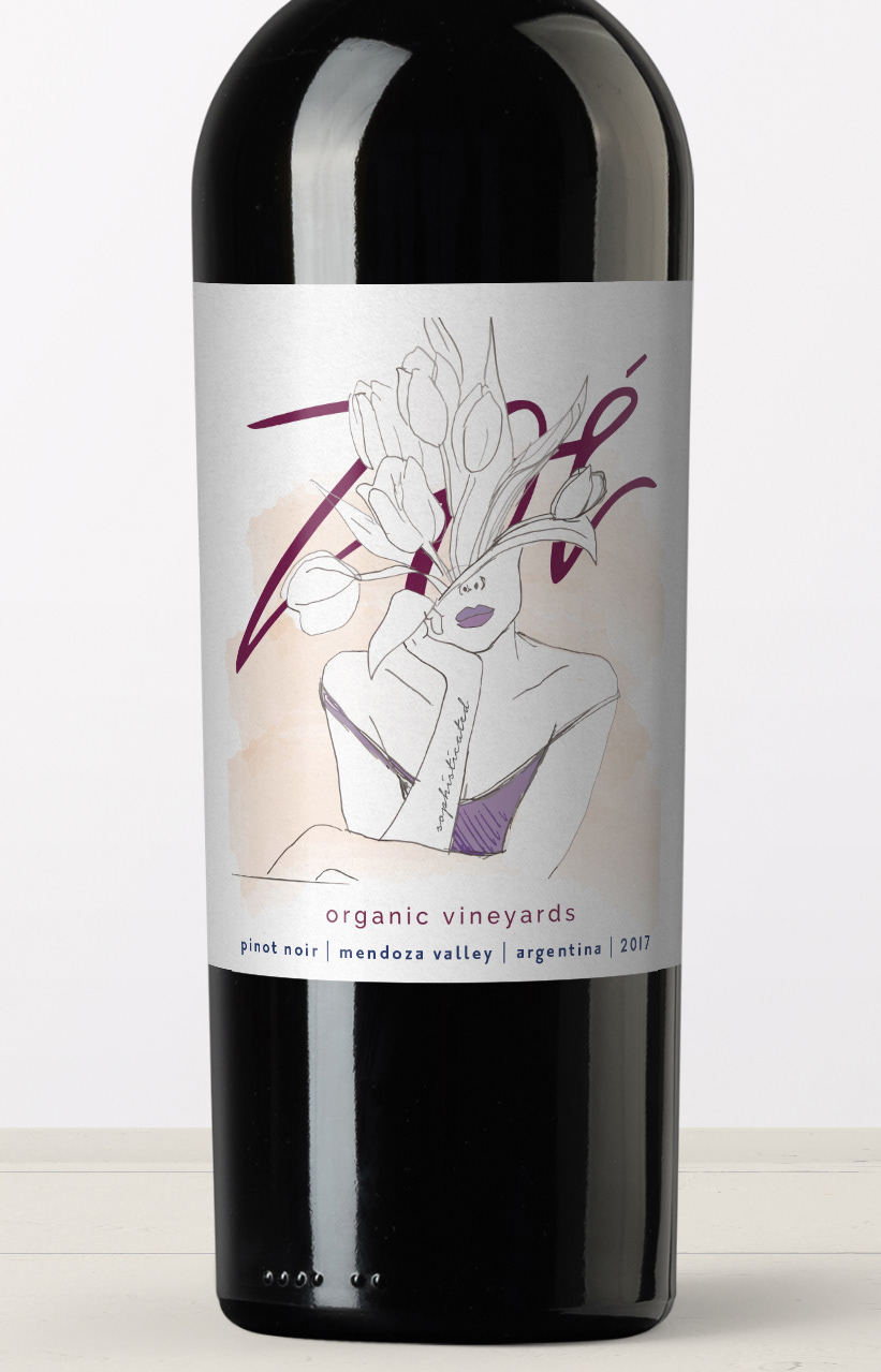
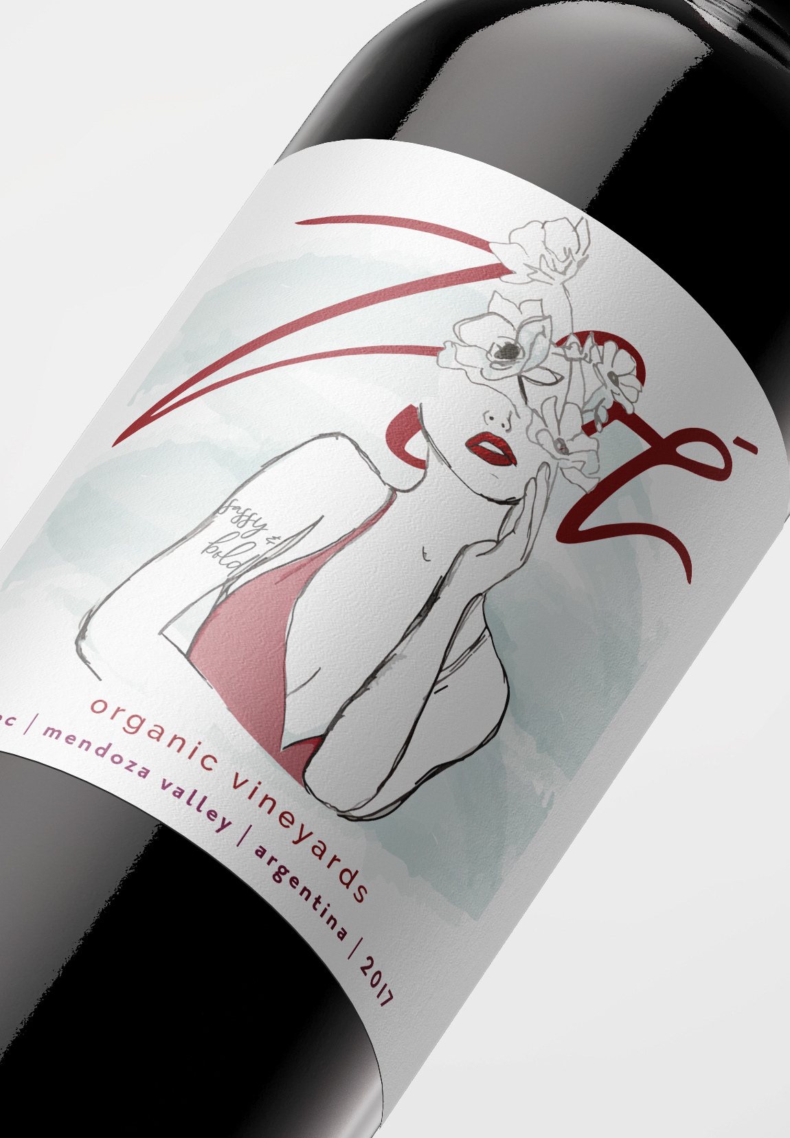
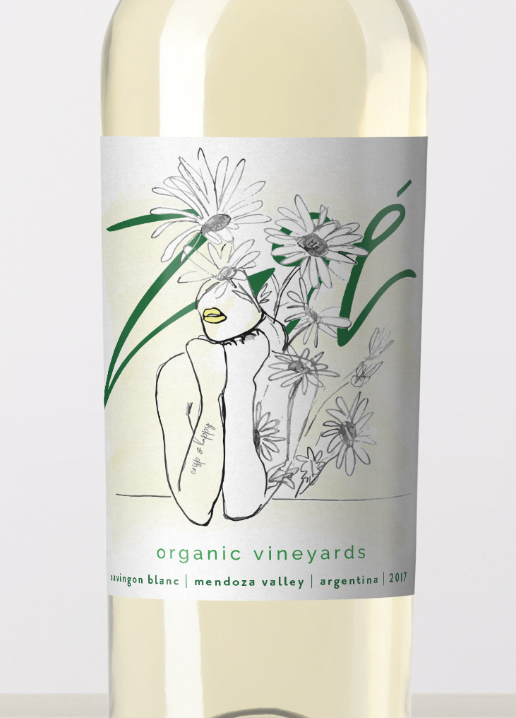
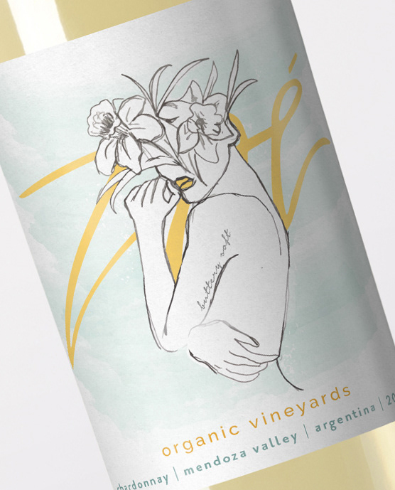
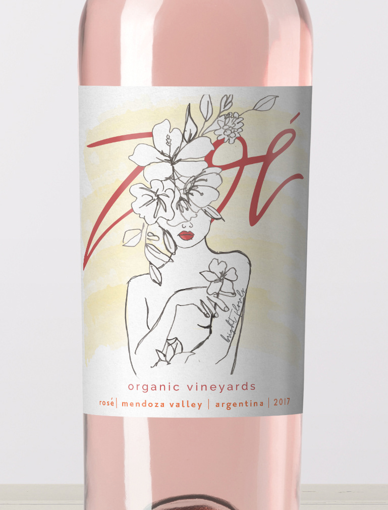
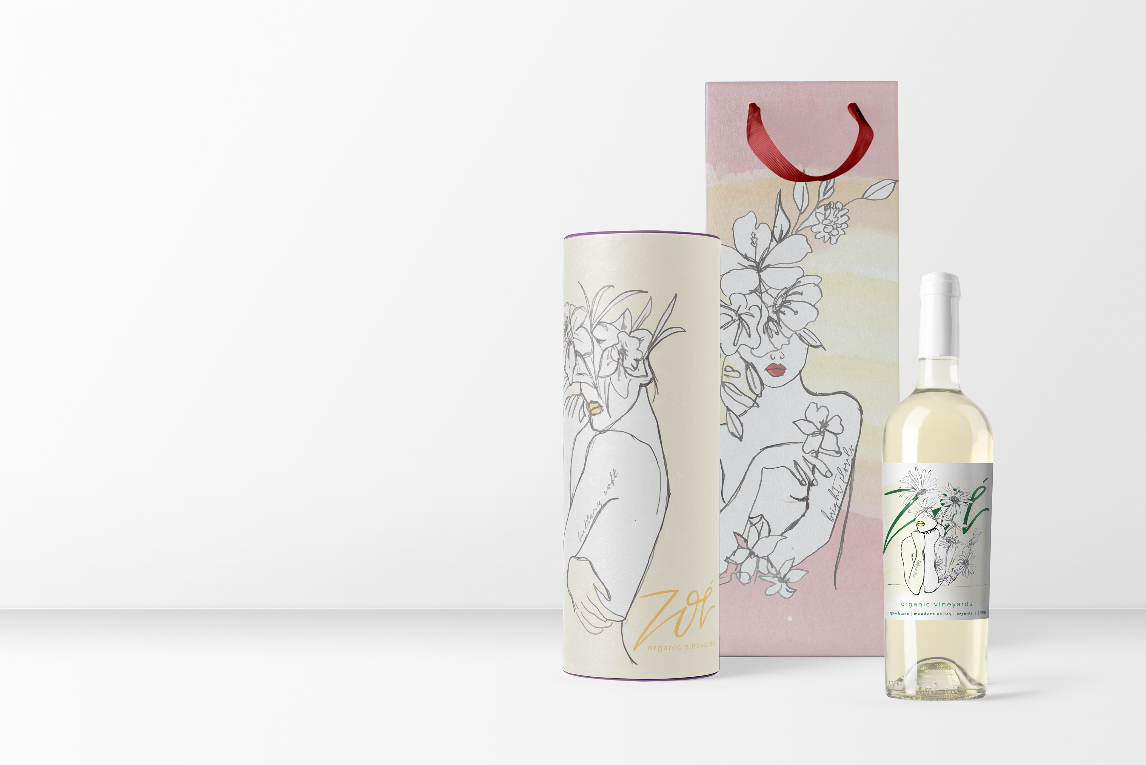
Zoé in Greek means life in all of its manifestations. The concept behind Zoé Organic Vineyard was one that embodied the goodness of life and was a wine that was made the way it should be - Naturally and Organically. It was designed to be a family owned and operate winery located in the Mendoza Valley, Argentina. At Zoé, the goal was to combine traditional wine making methods and the best of modern wine making to showcase the best these grapes have to offer. With minimal manipulation and no additives, the wines would express the true nature and beauty of the fruit and the terroir.
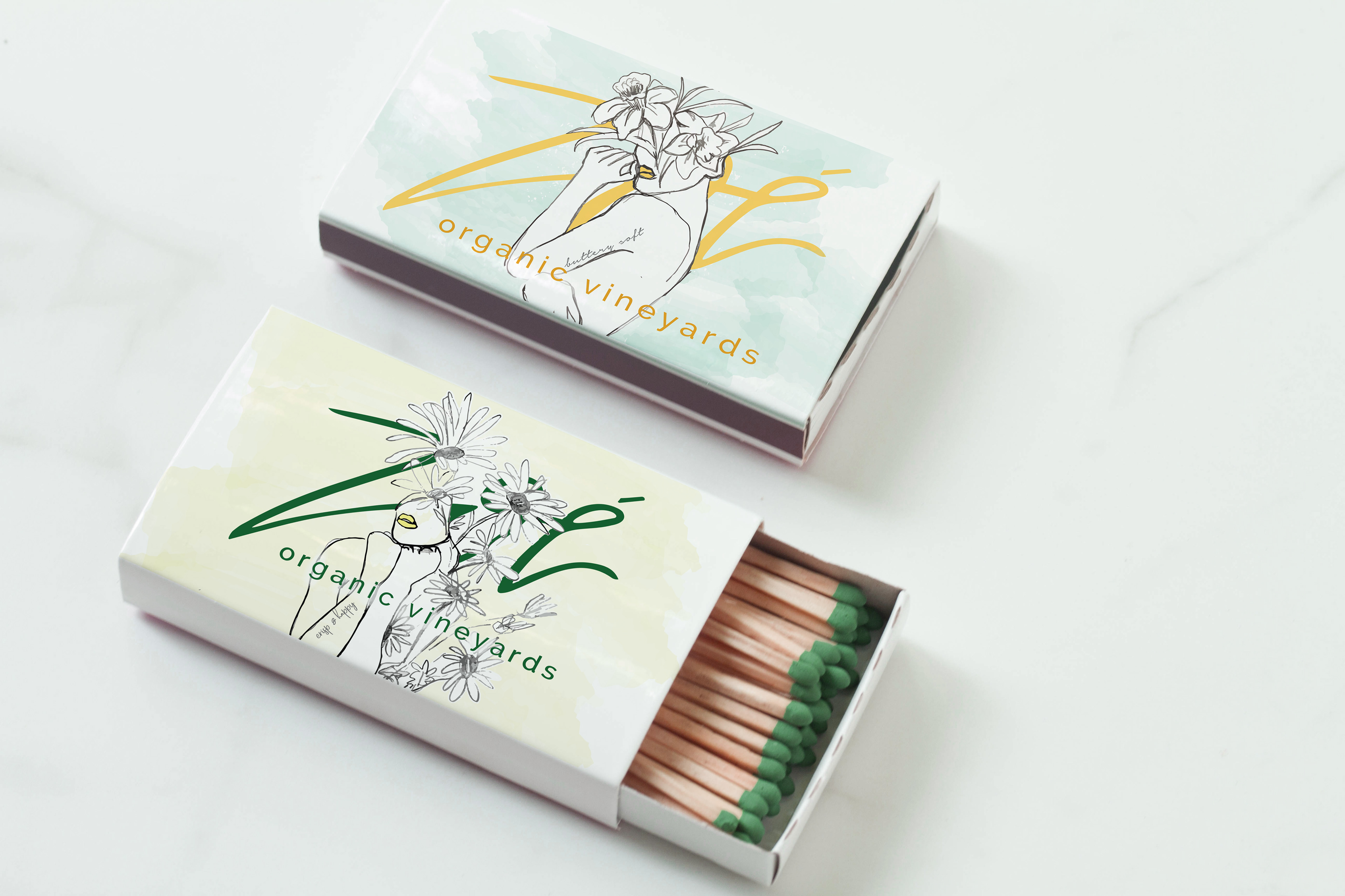
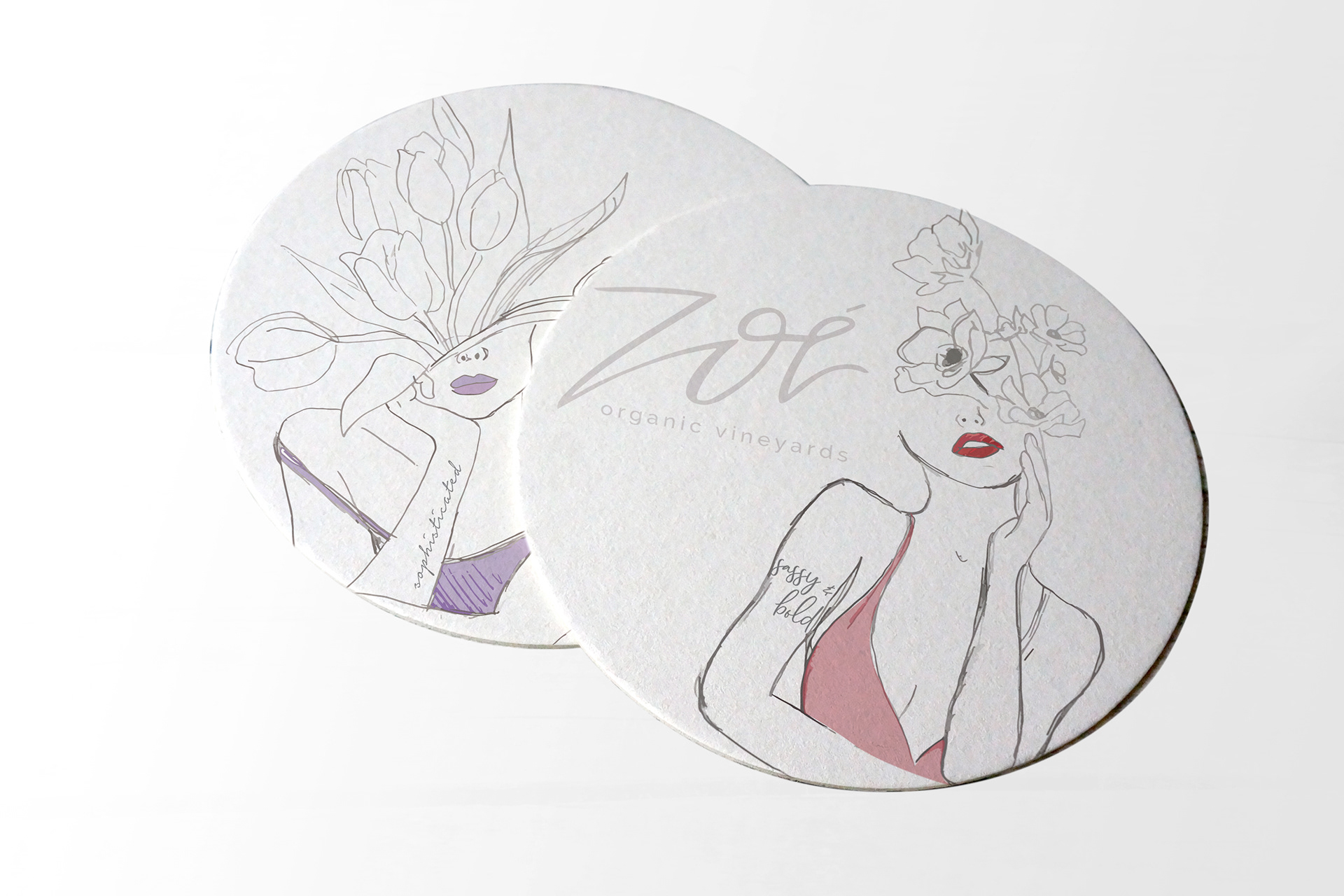
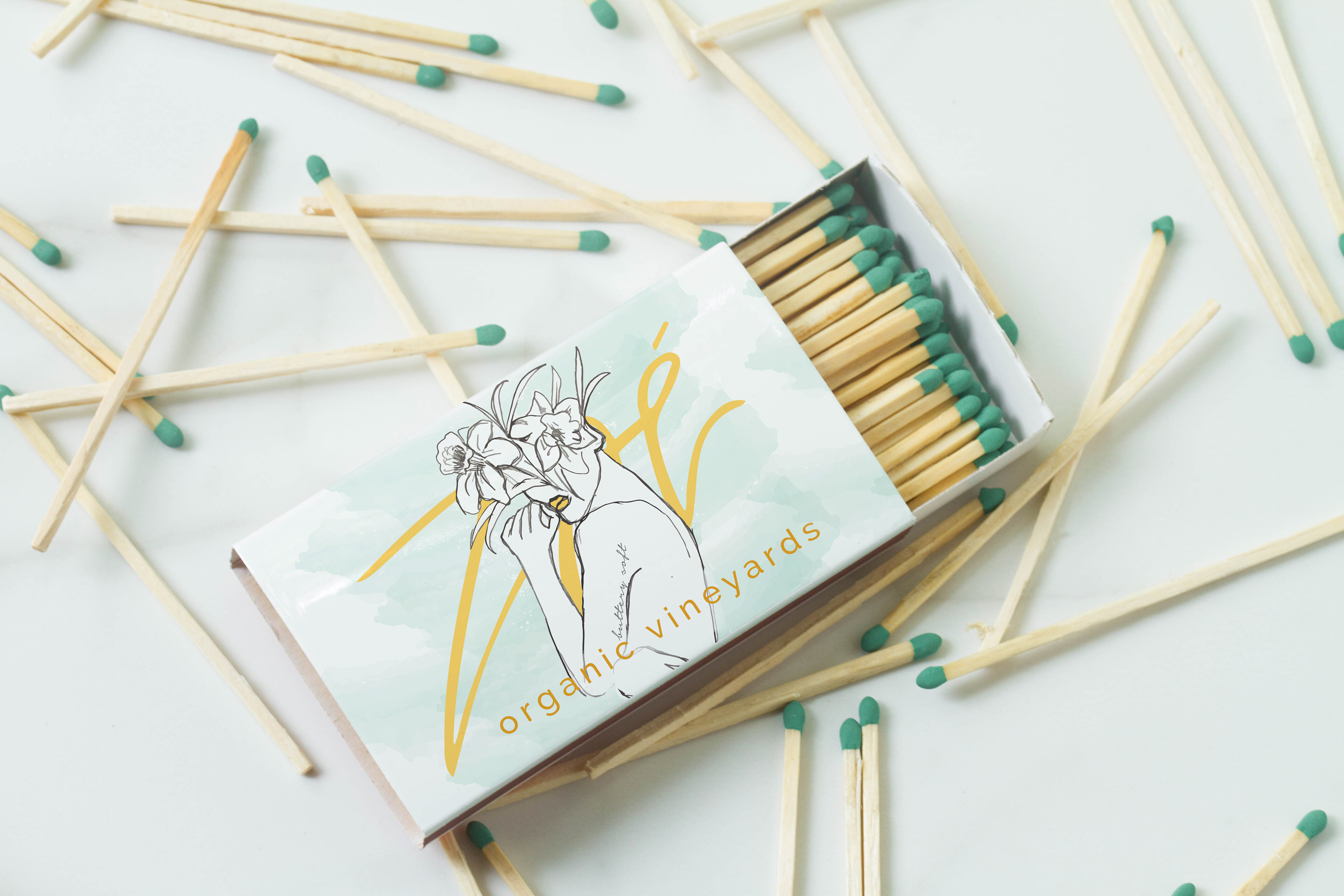
With this in mind developing a design that suited the ideals of the vineyard as well as the target consumers, aged 25-45 years of age and who were predominately female (as women tend to search for healthier options). A brand developed around the idea of life, growth and nature. Utilizing colors that were from nature and the wine like burgundys, peaches, yellows, oranges blues and greens. As well as a mixing typography styles such as sanserif and script. This helped complete the brand as well as building out the wine label system and other brand deliverables. The illustrations further conveyed the heart of the brand to show nature, growth and the personality of each wine.
LABEL DESIGN
PACKAGING + MARKETING COLLATERAL
© Taylor Sayyah 2019